Watch out! These Filipino movies will inspire you to travel the #PhilippinesFirst.
7 Tips to Improve Your Instagram Travel Grid

Also read: 7 Ways To Take Better Photos With Your Smartphone
Have you been thinking about making your Instagram (IG) grid all about travel? Or maybe you’ve done that already. I know how stressful it can be to think about what photo to post next on your grids. Being travellers, I know we have so many pictures that have yet to see the light of day in IG because they’re just too many. How to post them without jeopardizing your grid? Here are some tips.
1. Keep shooting and post later

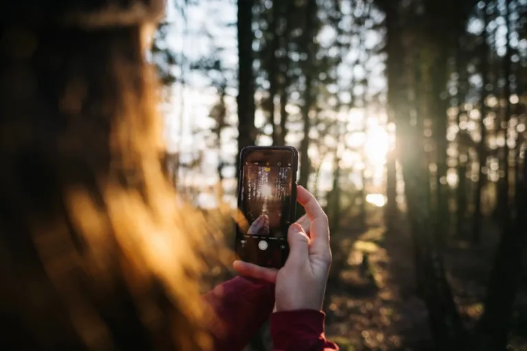
I know, I know. Whenever we’re exploring a new place, we get excited, start taking photos and immediately upload to social media (if we have internet). But stop right there, because it might be smarter for you to shoot now but post later. When you get back to your accommodation, go through all of your photos and see which ones are the best to post for the day. Sometimes, it’s easier for us to pinpoint the photos best suited to our IG grids when we’re not in the midst of exploring or touring. You don’t want to regret uploading a picture when so many people have already seen, commented or liked it, do you?
2. Try adjusting the photo’s brightness

Sometimes, we think we took a bad photo for reasons we can’t point out right away. But in most of these times, the issue is the lighting. The photo isn’t appealing because it might be darker (and sometimes lighter) than how you see it in person. When you edit, always toggle with the brightness to see what your photo looks like in different levels of brightness. After you’ve adjusted this, try playing with the saturation and shadows. A little editing (not filtering) could make the world of a difference.
3. Don’t post blurry photos
There are unintentional blurry photos, then there are intentional stylized blurry photos. Drop the unintentional blurry photos straight away. In my personal opinion, you should save stylized blurry photos for photo albums on Facebook because they could ruin the consistency or feel of your IG grid unless that’s the theme you’re going for. If you really want it to be part of your IG photos, maybe you could make it part of a carousel after a clearer photo, which will be the one to appear on your grid.
4. Stick to a theme

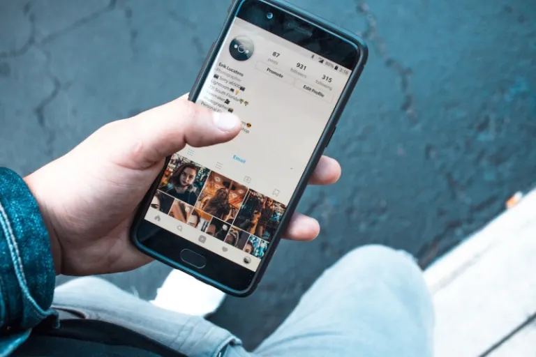
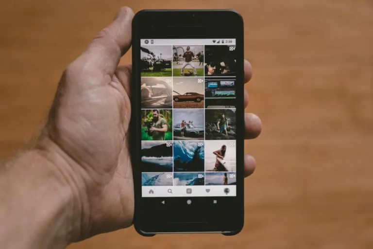
I’m sure you’ve seen so many travel bloggers do this on their IG accounts. They stick to a particular look, feel, tone, pattern, colour, and even photography style. Many people have started to do this because they want their grids to be as customised as possible. It’s also a way of branding yourself on social media and to attract more followers to your profile because if you manage to keep a theme, your IG grid will definitely look good and could even become iconic. But of course, sticking to a theme isn’t easy and can sometimes be limiting. Know yourself well enough if this tip is for you or not.
5. Don’t stick to a theme

If you can’t find it in yourself to stick to a theme, don’t force it. There’s nothing wrong with posting photos with different tones or style that are far from each other. What’s important is to edit your photos properly and according to your liking. The trick is to avoid flashy editing, make use of natural light, and be careful about posting strong colours. If it isn’t appealing to your eyes, then most likely, it won’t be appealing to the eyes of your followers. Another advantage of not having a theme is that you can post any photo the way they’re naturally seen. Sometimes when people edit tone and colour too much for the sake of their theme, what you see in the photo is way different than what you’ll see in person.
6. Upload in threes
To make your grid look more personalized, uploading in threes is a good idea, especially if you don’t have a theme. You can strategize what three photos will look good, side by side in a row, without forcing a consistent look in your whole grid. People who upload in threes usually pick photos that have similarities such as the location, background colour, subject, etc. At least the three in the same row will have some sort of pattern to them and followers will know that you still think things through before uploading photos.
7. Take photos of scenery more than selfies

Not that we’re condemning selfies, but do remember that you are trying to create a travel grid, so you might want to take it easy on the selfies. People who are interested in travel accounts will want to see different sceneries, landscapes, attractions, and candid moments rather than selfies. Of course, the occasional selfie or groufie wouldn’t hurt, but try to minimise them.
Also read: Travel Photography: 7 Tips For The Narcissistic Travellers
Creating an IG travel grid is a challenge, but it can also be fun and fulfilling. I think the most important tip though, is to know your own aesthetic, then follow the practical tips listed above. So, do you think you can do it?
Published at
About Author
Therese Sta. Maria
Subscribe our Newsletter
Get our weekly tips and travel news!
Recommended Articles
10 Filipino Movies That Will Inspire You to Travel the Philippines First I Decided to Become a Digital Nomad in the Philippines & Here’s What I Learned I brought my family along to a 22-day journey around Eastern Mindanao, working online along the way, and here’s what I learned.
LTFRB Suspends Uber: How Is It Affecting Our Travels? So what do the riding public and travellers have to say with Uber’s recent suspension?
Kickstart Your Travel Blogger Status With These 5 Blogging Platforms Are you an aspiring travel blogger? Let this guide help you choose the blogging platform for you!
8 Travel Movies to Watch If You’re Spending the Holidays at Home These ought to give you more travel inspiration.
Latest Articles
Sleepy Shepherd Bulacan: Rates and Travel Guide to This Instagrammable Countryside-Style Airbnb The coziest honeymoon and group hangout spot in Bulacan!
6 Best Boracay Beachfront Hotels for Breakfast with A View Best Boracay Beachfront Hotels for Solo Workations (Budget-Friendly!)
LRT1, LRT2, and MRT3 Suspension During Holy Week 2026 Plan ahead for rail closures
Cheapest Way to Commute in 2026: 5 Hacks to Beat Rising Fuel Costs in PH Hacks to slash your monthly transport bill by 7,000 PHP!
Manila Libreng Sakay: How Jeepney Drivers Earn While Commuters Ride Free Free rides and guaranteed pay

